At work, I am working on rewriting a bunch of maps so that they are consistent and mobile-friendly (a.k.a. responsive). When I starting searching for some basic how-tos I turned up nothing. I did find how to make Google Maps itself responsive. My issue was how do I add a legend and form that will filter or add content to the map and keep it mobile-friendly. Since I couldn’t find anything, I set forth to make something myself. In one weekend, I created a basic framework utilizing Bootstrap, the following week I refined and finalized the application and I think it turned out well.
I made the template open-source so that others can benefit from what I learned and help make this a better template in the future. I hope others can help me make this even more accessible and improve the template further.
I used Bootstrap because that is what I am most familiar with. In the future, if I have time, I want to try to eliminate Bootstrap to reduce the overhead. Once our new website launches, I’ll add some examples of what I created with the template so you can see why I felt this was important.
Here is what the large-screen version looks like:
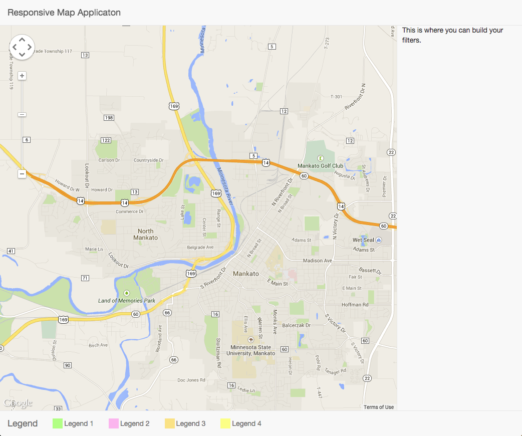
Large screen view of application
Here is the mobile views:
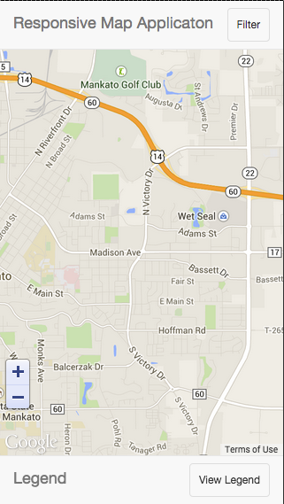
Mobile view of application
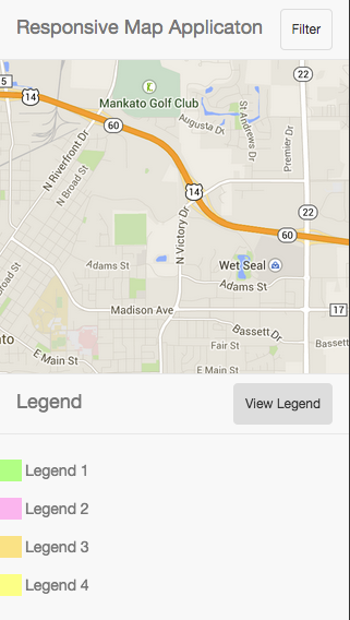
Mobile view of legend
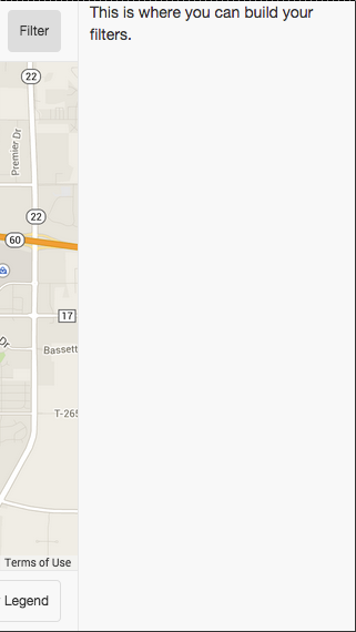
Mobile view of filter
No responses yet